

What is the color of the year? How and by whom is it chosen?
The color of the year is announced every year by the Pantone company. This company announces the color of the year by considering factors (which we will explain to you later). This company provides a universal language of color that makes decisions. It makes the importance of color at every stage of the workflow possible for brands and manufacturers. The company wants to draw attention to the relationship between culture and color and show its audience how what happens in global culture through the language of color It is expressed and reflected.
About Pantone Color Institute
The Pantone Color Institute is the company that recognizes and announces the color of the year. The company anticipates global color trends and advises companies on color in brand identity and product development, for the application and integration of color as an asset. Strategic recommendations. Recognized worldwide as the leading source of color information through seasonal trend forecasts, custom color development and palette recommendations for product and corporate identity, the Pantone Color Institute works with global brands to incorporate the power, psychology and emotion of color into their design strategy. use. As a result, Pantone Color of the Year discussions are not held in a separate meeting at a specific time of year. It’s a long, continuous conversation going on between a group of people of color.Our Pantone Color Institute team members come from a wide range of design, cultural and geographic backgrounds. What brings them together is their expertise in color and design and their ability to see the world through the lens of color. This is why I liken them to anthropologists of color. They have this intuitive ability to connect everything that is happening in the world and translate it into the language of color. Pantone color codes are used in various sectors such as fashion industry, decoration, architecture, beauty. Pantone standards are available digitally and physically.
The world’s first color of the year
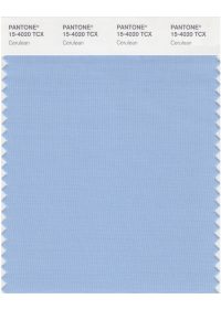
The world’s first color of the year was in 1999, which was announced by Pantone for the first time. This color was a light sky blue called Cerulean. This color expressed inner and spiritual peace, and also during the company’s research, it came to the conclusion that the color Cerulean blue reduces heart rate and blood pressure. Therefore, the fashion industry used this color in their collections.
How to choose the color of the year
Twice a year, a Pantone executive and many other anonymous people representing corporate, fashion, design and more gather in an undisclosed location to discuss and dictate color trends for the coming year. Some say they look at what’s currently being used on the runways in Paris and while that may play a role, they literally look at a multitude of influences and come up with a concept for the color they choose. They bring together.The color they choose as the Pantone Color of the Year is larger than a design area or department. The color they choose is a color that expresses the mood and attitude of consumers, a color that will resonate around the world, a color that reflects what people are looking for. A color that can hope to respond to what people feel they need.
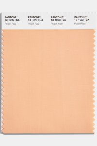
Color of the year 2024-Peach Fuzz
This year, World Color officials chose a soothing tone in response to global turmoil. “As much an idea as a feeling, Peach Fuzz awakens our senses with the soothing presence of touch and cocoon warmth,” Leatrice Eiseman, executive director of the Pantone Color Institute, said in a statement. Meanwhile, Peach Fuzz’s predecessor, Viva Magenta, was chosen in 2023 as a reflection of new technologies such as artificial intelligence and the metaverse.
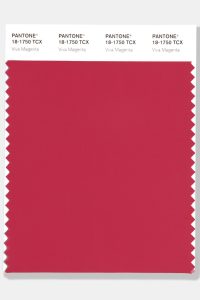
Color of the year 2023 Viva MagentaViva Magenta
Crimson red with pink undertones creates a balance between warm and cool. Rooted in nature, this color combination is powerful, forceful and decisive, but not aggressive.
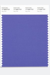
Color of the year 2022 Very Peri
A vibrant blue with vibrant red and purple undertones. Feeling futuristic and encouraging creativity, Very Peri combines the loyalty and stability of blue with the energy and excitement of red.
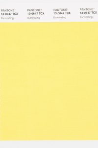
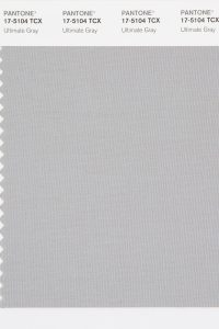
Color of the year 2021 Illuminating and Ultimate Gray (common)
For the second time, the combination of two colors was chosen as Pantone’s Color of the Year.
Illuminating This gem represents brightness, brilliance, joy and vitality. A warming yellow color infused with solar energy.
Ultimate Gray resembles beach pebbles and natural elements whose weathered appearance highlights its ability to withstand the test of time.
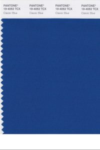
The color of the year 2020 is Classic Blue
Classic blue with a wide presence evokes a vast and infinite sky that opens up a world of possibilities.
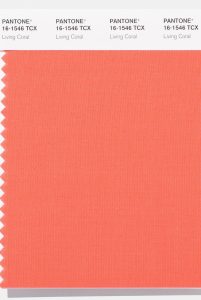
Color of the year 2019 Living Coral
Living Coral is a vibrant, life-affirming coral color with golden undertones that energizes and enlivens with a softer edge.
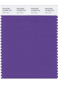
The color of the year 2018 is Ultra Violet
A highly provocative shade of purple represents originality, ingenuity and visionary thinking that leads us into the future.
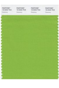
The color of the year 2017 is Greenery
This color represents freshness and revival and is also a symbol of a new beginning.
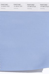
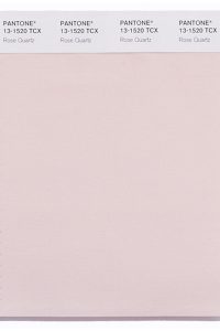
Color of the year 2016 Rose Quartz & Serenity (combined)
For the first time, the combination of two shades – Serenity and Rose Quartz – was selected as Pantone’s Color of the Year.
Serenity is weightless and airy, like the vastness of the blue sky above us, and brings a sense of calm even in turbulent times.
Rose Quartz is a persuasive yet gentle tone that conveys compassion and a sense of calm.
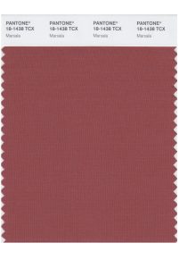
Color of the year 2015 Marsala
A strong and earthy natural red wine, Marsala enriches our mind, body and spirit.
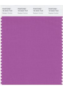
2014 color of the year Radiant Orchid
Enchanting harmony of fuchsia, purple and pink colors, Radiant Orchid inspires confidence and radiates happiness, love and health.
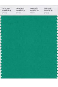
The color of 2013 is emerald
Brilliant and magnificent emerald color is the color of beauty, new and fresh life.
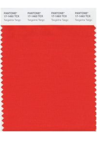
Color of the year 2012 Tangerine Tango
This color, reminiscent of the radiant shadows of the sunset, is a magnetic and lively color that generates warmth and energy.
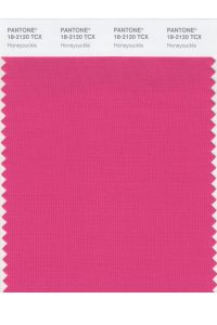
The color of the year 2011 is Honeysuckle
This color expresses cheerfulness and optimism, and also evokes nostalgic summer feelings.
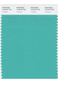
The color of the year 2010 is Turquoise
Combining the calming qualities of blue and the energizing aspects of green, turquoise inspires thoughts of relaxation, tropical waters, and a relaxing escape from the world’s everyday problems while restoring a sense of well-being.
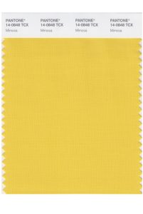
Color of the year 2009 Mimosa
This color is warm and attractive, no other color expresses hope and confidence except yellow.
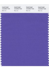
Color of the year 2008 Blue Iris
Combining the stable and calming aspects of blue with the mystical and spiritual qualities of violet, Iris fulfills the need for reassurance in a complex world while adding mystery and excitement.
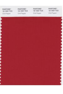
Color of the year 2007 Chili Pepper
This color represents sharpness, excitement, complexity and seductiveness. Chili pepper indicates an outgoing, confident and intelligent attitude in design.
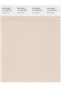
Color of the year 2006 Sand Dollar
Natural and organic, meant to express concerns about the 2006 economy, is a warm shade that soothes the nerves. It is also reminiscent of the desert and soft sandy beaches.
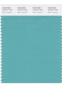
Color of the year 2005 Blue Turquoise
A calming and soothing turquoise blue inspired by the color of the sea, it is more subtle than true turquoise.
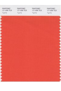
Color of the year 2004 Tigerlily
Bright, bold, passionate and rejuvenating, Tigerlily contains red and yellow and draws inspiration from the flowers around us.
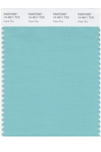
Color of the year 2003 Aqua Sky
Soft, calm, cool, this color is a manifestation of peace.
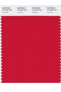
Color 2002 True Red
This color symbolizes love, passion, strength, depth and meaning.
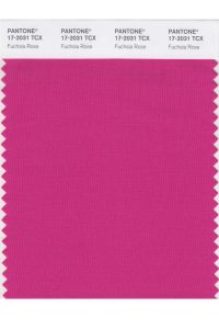
Color of the year 2001 Fuchsia Rose
It is a feminine color, bright, good feeling, exciting and at the same time warm and lovely.
Color 2000 Cerulean
The first Pantone color of the year was cerulean blue. This color refers to calmness and transparency.