What is the color of 2025?
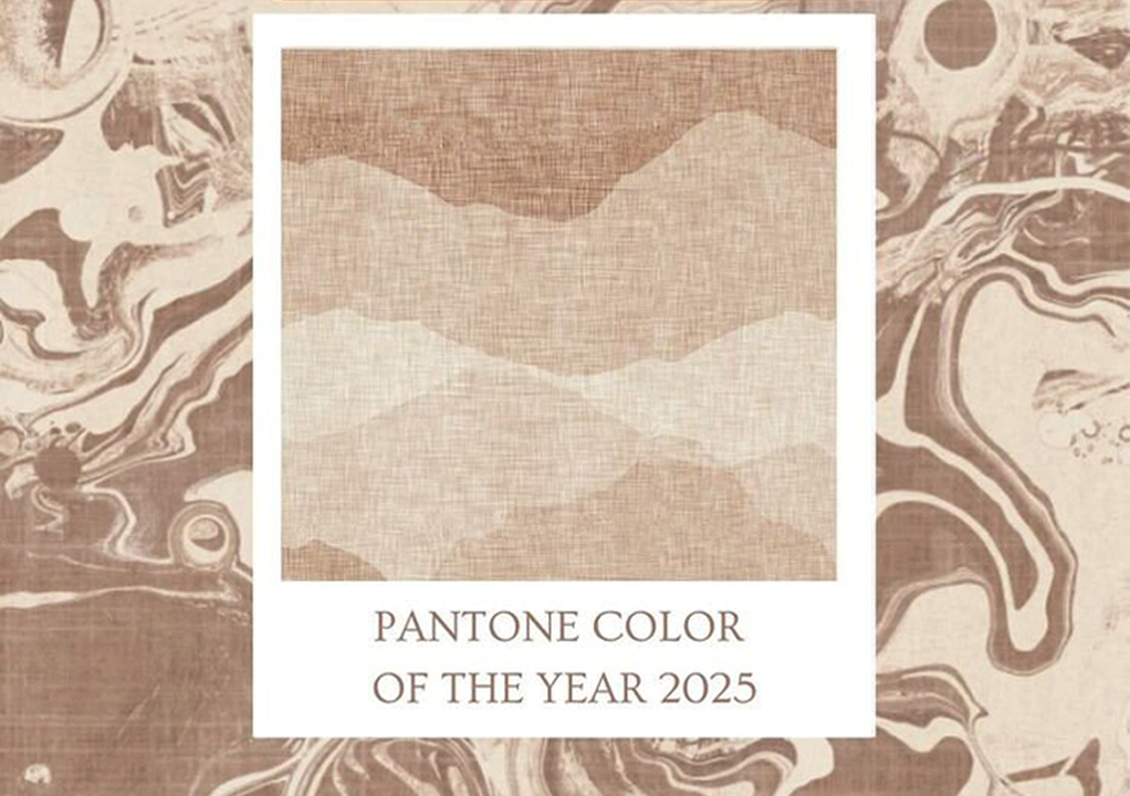
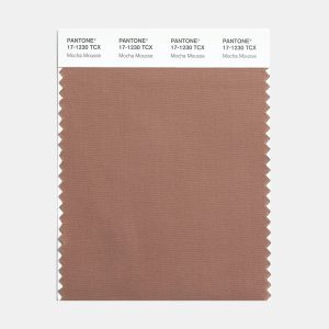
Pantone has announced its Color of the Year for 2025 as PANTONE 1230-17 Mocha Mousse, a warm and rich brown that balances modernity with timelessness.
What is Pantone and where is it located?
Pantone is the company best known for the Pantone PMS Matching System, a standardized color reproduction system used worldwide in industries such as graphic design, fashion, printing and manufacturing. This system ensures consistent color communication across different production processes and materials. The Pantone system consists of thousands of unique colors, each assigned a specific number or name. This allows designers and manufacturers to reference the exact color used in a product and ensure uniformity.
Pantone’s color of the year is determined on what basis?
Pantone’s Color of the Year program engages the design community and color enthusiasts in a conversation about color and highlights the relationship between color and culture. Every year, Pantone chooses a color that captures universal appeal. The color of the year expresses the state and attitude of the world, which reflects the collective desire in the form of a single and distinct color. and to show her audience how what is happening in our global culture is expressed and reflected through the language of color.Pantone’s Color of the Year is determined through a thoughtful and comprehensive process that reflects cultural, social and economic influences on a global scale. Here is an overview of the basis of this choice:
Trend analysis and forecasting:
Global trends: Pantone tracks trends in fashion, art, design, film, technology and even socio-political movements. They identify colors that are prominently used or associated with these areas.
Cultural Resonance: They analyze how certain colors resonate in the current zeitgeist, representing collective emotions or aspirations.
Psychological and emotional effects: A color is chosen to evoke a particular mood or feeling that is in harmony with the general feelings or themes of the coming year. For example, calm tones may reflect a need for relaxation, while bold colors may indicate energy and optimism.Socio-
Economic Context: Pantone considers the socio-economic climate such as periods of uncertainty, recovery or celebration. Colors are chosen to symbolize resilience, hope, unity or change and align with what society may need or want.
Global Influences: Insights are gathered from various industries around the world, including travel destinations, emerging artists, new technologies and materials. These influences shape choice by showing how different cultures interact with color.
Design trends and applications: Pantone works with industry experts and design professionals to understand how specific colors are used in different sectors such as interior design, packaging and digital media.
Expertise of Pantone Color Institute:
The Pantone Color Institute’s team of experts conducts research and discussions, often holding secret meetings with industry leaders, to distill their findings into a unique color. The chosen color carries a message about where the world is going or what it needs, making it both a reflection and a guide to creative industries and consumers.
Why was Mocha Moose chosen as the color of the year?
The color that Pantone chooses as the color of the year is a color that is important in all areas of design. It is a color that has the ability to convey a color message that best reflects what is happening in our global culture at a particular moment in time.The color that we see passes through all parts of the design and acts as an expression of a spirit and an attitude. A color that represents what people are looking for and what qualities they feel they need that color can hope to answer.
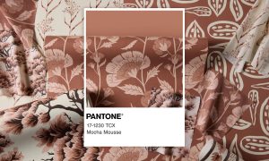
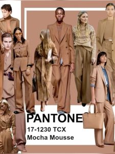
Pantone chose Mocha Mouse (PANTONE 1230-17) as its Color of the Year for 2025 for its evocative nature and warmth, reflecting the global desire for harmony and comfort amid current political turmoil.
Leitris Eisman, executive director of the Pantone Color Institute, described Mocha Mousse as expressing “a level of contemplative pleasure” that is “complex and lush, yet an unpretentious classic.” Laurie Pressman, vice president of the Pantone Color Institute, noted that the choice reflects An improvement on last year’s color is Peach Fuzz, which expands on relaxation and simple pleasures.Mocha Mousse’s choice also aligns with a growing movement to connect more closely with the natural world, as it is a versatile, genderless and functional neutral shade that evokes a sense of comfort and authenticity.
The color of the year 2025 is a deeply seductive color that inspires you with a tactile and emotional connection. This exquisite brown, softened to earth tones, exudes a calm elegance. One of its greatest strengths is that it allows versatility to enhance a wide range of fabrics, shapes and silhouettes with subtle elegance. Mocha mousse adds richness to fabrics and increases the beauty of textures, folds and curtains.
Enchanting in its coziness, this soft and warm color is all about indulgence and soothing the senses. These selections highlight the trend towards warm, earthy colors and calm greens in design for 2025. With its sophisticated, earthy elegance, this color can stand alone or act as a versatile base, allowing for a wide range of palettes and applications – from minimalist designs to highly detailed designs – across all industry-focused designs. enhance color Complex and lush yet classically unpretentious, Mocha Mousse expands our perception of browns from humble and unassuming to idealistic and luxurious.
Mocha Mousse offers a restrained elegance on lighter, semi-sheer fabrics and creates subtle shadows that create a layered, ethereal effect. Its responsiveness to light and color changes adds subtle complexity to transparent and silky layers and gives them a weightless and luminous quality. It provides a sense of comfort and intimacy. In smooth and layered forms, color shines in its most attractive form and creates an atmosphere of calm sophistication.
Pantone’s professional team believes that the color of the year 2025, i.e. Mocha Mousse, is the advanced and updated color of last year, i.e. Peach. According to experts, mocha mousse evokes the feeling of a light and delicious food for the audience. Mocha Mousse is one of the most delicate shades of coffee. The color of 2025 is a warm and rich brown color that people feel very comfortable with.
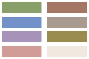
Mocha mouse color palettes:
A versatile shade with inherent complexity and earthy nuances, Mocha Mousse creates a strong color base that complements a variety of applications, both minimalist and richly decorated, in design and all color-conscious industries. Five unique color palettes have been created with PANTONE 1230-17 mocha, each of which conveys its own distinct mood. In each of these five color stories, four color harmonies have been suggested.
What is the color psychology of 2025?
In 2025, color psychology emphasizes warmth, comfort, and richness, reflecting the collective desire for comfort and well-being. Pantone’s color of the year, Mocha Mousse, is an example of this trend. This subtle, neutral color is associated with thoughtful pleasures and everyday pleasures, making it popular among designers and minimalists alike. The continued popularity of millennial pink, a pale, warm shade, further emphasizes the preference for soft, sweeping colors that offer versatility and neutral appeal in interior design.
Conversely, experts predict a shift away from cool neutrals such as grey, black and stark white in favor of warmer, richer colors such as chocolate browns, chocolate browns and warm reds and purples. This move toward a cozy aesthetic reflects a broader desire to create inviting and harmonious environments. In short, the color psychology of 2025 focuses on embracing warm, rich colors that promote comfort, inclusiveness, and a sense of well-being, moving away from the cooler, sterile palettes of years past.
What effect does the color of 2025 have on the fashion world?
This choice is expected to significantly influence the fashion industry, driving trends towards earthy and soothing colors.
Influence on fashion trends:
Adoption by designers: Prominent fashion houses such as Fendi, Acne and Gucci have already included mocha mousse in their latest collections, showcasing its versatility and appeal.
Versatility in Style: Fashion experts suggest mocha mousse as a base yet accent color suitable for all seasons. It goes well with different accessories and can be combined in monochromatic outfits or with contrasting colors for a dynamic look.
Aligning with current trends: The choice of Mocha Mousse is in line with the ongoing trend of minimalist fashion and “quiet luxury”, where subtlety is preferred over bold statements.
Wider penetration:
Consumer appeal: Mocha Mousse’s comforting and indulgent qualities resonate with consumers seeking warmth and simplicity in their fashion choices, reflecting a broader cultural desire for comfort and connection.
Complementary nature: Mocha Mousse’s neutral yet rich color complements a range of other colors, making it a versatile choice for designers and consumers looking to refresh their wardrobes.
In short, the selection of Mocha Mousse as the color of 2025 is set to influence fashion by promoting earthy, soothing hues that match the current trends towards minimalism and understated luxury.
How to use mocha color in your style?
Mocha, a warm and versatile shade of brown, can add a sophisticated and cozy vibe to your style. Here’s how to incorporate mocha into your wardrobe and overall look:
clothes:
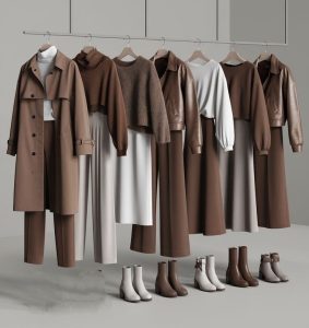
Neutral Pairings: Combine mocha with white, cream, black, and gray for an elegant and timeless look.
Warm colors: Combine mocha with burnt orange, mustard yellow, or olive green for a cozy, fall-inspired outfit.
Bold accents: Use mocha as a base and add colors like teal, fuchsia or cobalt blue.
Monochrome: Create a colorful outfit by layering different shades of brown, beige and matrix for a stylish and modern look.
Outerwear:
For a polished and versatile fabric, invest in a mocha colored coat, suit or cardigan. Use mocha as a color for a wool coat or puffer jacket in winter.
Conclusion:
A textile design company can use the “Color of the Year” in a variety of strategic and creative ways to align with trends, appeal to customers, and stay competitive in the design market. Color of the year can be applied to a variety of fabrics, from lightweight materials to upholstery fabrics.
By integrating the color of the year into its offerings, Arachap can align itself with current design movements, inspire creativity among customers, and strengthen its market presence. Also, in seasonal collections, incorporate the color of the year in new fabric collections that match current trends. Offer personalized design advice or tools that integrate the color of the year into their fabric choices.
Click for more information